Backgrounds are often a simple addition that can have quite an impact on the feel of your finished book. In this article we will provide some guidance on when and how to use photo book backgrounds for maximum impact.
When to use backgrounds
Once you have laid out your pages, you can consider any additional design features you may wish to add to your book. Many photo books stand up well with plain black, white, or neutral coloured backgrounds. Wedding and portfolio books often fall into this category. The quality of the images, and the chosen subject matter are enough. Fancy backgrounds are simply not required, and if used, can often detract from the key subject matter on the page.
At the other end of the spectrum are books compiled from images taken some decades earlier. They might be out of focus, faded, or poorly composed. But they represent important memories, and so demand to be included in the book. These types of projects can benefit enormously from judiciously chosen backgrounds. If they are well chosen, they can act to tie the pages of the book together, and make it visually more appealing, as well as coherent.
How to choose the right backgrounds for your project
Choice of backgrounds is often a very personal issue. Nevertheless, here are some tips that may improve the look of your books:
Choice of colour palette
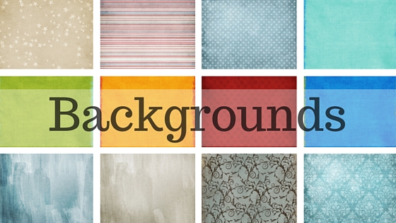
- Backgrounds should compliment your images, not compete with them. Try to avoid overly bright/busy/contrasting digital papers. Look for subtle textures, and patterns with low to medium contrast.
- Cue your colour choice (whether plain, textured or patterned) from the colour palette of the page (or opposing page).
- Your book will be more coherent, and flow better, if you restrict yourself to no more than 5 or so different colours. Avoid using every colour under the rainbow. A good approach is to run through a preview of your book and note any pages that don’t seem to “belong” with the rest of the book, and try changing the page background for a better “whole book” experience.
General Tips
- As a general rule, avoid dark backgrounds behind dark photos, or light backgrounds behind light photos. Images tend to disappear, rather than stand out.
- It’s OK to have white backgrounds! In many cases the best background for the page could be white. In particular, this can work well for colourful beach shots, good quality black and white photos, as well as professional images (such as wedding photos).
- A spread may have 2 different backgrounds (one each for left and right hand pages). But you should always make sure they don’t clash.
- Particular projects may benefit from certain types of backgrounds. For example, books with numerous historical images may lend themselves to a vintage and/or grunge feel. Asian travel books may work well with sparingly applied vividly coloured fabric backgrounds. Wedding books might work well with subtle cream or black damask backgrounds.
- For a truly “one-off” background, a watermarked photo may provide the perfect backdrop to a number of suitably placed foreground images.
Adding your own photo book backgrounds
Using Cahoots photo book design software, it is quite easy to apply backgrounds to your pages and experiment until you are happy with the overall result. A number of different colours and graphical backgrounds are supplied with the software. However, there will likely come a time when you wish to apply a particular background you have sourced or created yourself, or you may simply want to create a wider choice than is built into the existing tools.
Fortunately, our Windows and Mac OSX photo book design software both allow you to add your own backgrounds and save them in the software for future use.
Where to search for additional photo book backgrounds
But perhaps your first step will be to source some suitable photo book backgrounds to add to your collection. You can search the web using terms such as “digital scrapbook backgrounds”, “free digital scrapbook papers” etc. For best results, please ensure you choose high resolution files that are designed for 12″ x 12″ pages, at 300 dots per inch (DPI). If you don’t mind paying US$5 for a set of digital papers that you can use in your own projects as much as you want, Etsy is a good place to start your search. Equally there are many free backgrounds available on the wider internet (e.g. pixabay.com), but quality varies widely, and you will normally have to give up your email address to get access.
So now you are armed with some great advice on backgrounds, it is now over to you to choose what you want to take on board and put into practice. As always, we look forward to seeing your work roll out in a finished book.