
Making a photobook is a really enjoyable activity. But there is nothing worse than receiving your first photobook and discovering that it doesn’t quite live up to what you imagined, or match the design quality of books you have been inspired by. Here is a list of the four most common mistakes that we see here at Cahoots:
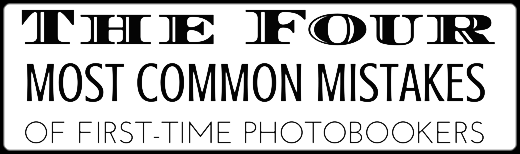
1. Not allowing for bleed
Avoid unwanted slithers of background by properly utilising bleed.
2. Not allowing for the gutter
Avoid content disappearing into the binding, or having to flatten the pages to read the text
3. Overestimating text size
Avoid setting text size based on what is readable on the screen – it will be bigger in print!
4. Mis-alignment of images
Similarly, if placing images freehand, any slight mis-alignment will be more obvious in the printed product, compared to the screen.
. . . . and here is how to fix them
OK – now you know what they are, here is what you can do about them. We’ve prepared a cheats guide to avoiding all these issues. If you wish can download a PDF version for reference. This document has been prepared with our previous Cahoots Easy Editor software in mind, but similar principles apply for our new Easy Designer software. Whichever software you are using, allowing for the gutter is not required if you are opting for a layflat book – just be mindful of the seam placement.